

A website can receive relevant traffic and still leave potential customers uncertain about what happens next. The enquiry form may work perfectly. The problem can occur much earlier: the visitor does not understand the offer, cannot find evidence that fits their situation or expects a difficult sales conversation after clicking.
A lead generation website audit examines the full path from arrival to a useful business conversation. It asks whether the right people can understand the service, trust the promise, take the next step and receive a suitable response. Counting form submissions is only one part of that job.
Use this checklist on one important service journey first. You will learn more from following an actual buyer’s route than from scoring every page against a generic list of design preferences.
1. Define what a good lead means
Before changing the website, agree on the outcome. A submission is an event. A qualified enquiry is a business judgement based on criteria such as service fit, location, need, timing and the information required to progress.
Write a short qualification definition your marketing and sales teams can both use. Then distinguish at least these stages:
- Enquiry received.
- Valid contact with a relevant request.
- Qualified opportunity.
- Consultation, appointment or proposal completed.
- Customer or another agreed final outcome.
Do not optimise the first stage while ignoring the rest. Removing every question from a form may increase submissions but leave the team unable to identify the service requested. Conversely, a very demanding form can discourage suitable buyers before a conversation starts.
2. Follow the promise from the traffic source
Choose a real entry route: an organic service query, a campaign ad, a directory listing or a referral link. Compare what the visitor was promised with the first screen of the landing page.
If the ad introduces a specific service, the page should acknowledge it immediately. If the search query is local, practical location information should be easy to find. If the visitor expects a product specification, a general company story creates unnecessary work.
Write the expectation in one sentence and check the page against it. This is a useful way to find “good pages” that are poor destinations for a particular campaign. A page can be well designed and still be the wrong next step.
3. Check the first-screen explanation
Show the page briefly to someone outside the business and ask what they think it offers. Do not introduce the company first. Listen for their words rather than correcting them immediately.
The opening should make four things accessible:
- What the service is.
- Who or which situation it suits.
- Why the visitor should keep reading.
- What the main next action is.
You do not need four separate headlines. A clear heading, a short supporting paragraph, one useful piece of evidence and a visible action can carry the message. If the offer itself remains unclear, use the brand strategy roadmap before polishing individual buttons.
4. Match proof to the buyer’s concern
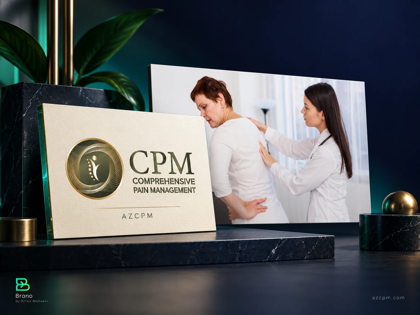
Brano’s portfolio includes AZCPM, a pain-management provider, and Central Valley Dentistry. In service categories like these, prospective patients need to understand the provider, location and practical appointment route. Evidence should help them make an informed choice rather than overwhelm them with broad promises.
The same principle applies outside healthcare. A homeowner considering a door system may need specifications and installation information. A company looking for a software partner may need a relevant demonstration and a clear scope of responsibility.
For each priority claim, ask: What would a cautious buyer need to see to believe this? Place the answer near the claim. A testimonial about friendliness does not establish technical capability; an unexplained graph does not establish a reliable commercial outcome.
5. Make the next action specific
“Submit” describes what the form does. “Request a consultation” describes the user’s action. The surrounding copy should explain what the person receives and what happens afterwards.
Avoid putting equally prominent actions in direct competition when they lead to different levels of commitment. A suitable structure might use a primary consultation action and a quieter link to a useful guide. On a product page, the primary action may instead be a quote request or product selection.
The goal is a clear hierarchy, not a rule that every page must have only one link. Navigation, accessibility and supporting information still matter. The visitor should simply be able to identify the intended next step without guessing.
6. Complete the form on a real phone
Test the complete journey with a realistic request. Check labels, keyboard types, validation, required fields and the behaviour of error messages. Confirm that entered information remains available when a correctable error occurs.
Then inspect the state after a successful submission. Does the page acknowledge receipt? Does the user know whether they should wait, book a slot or check their email? Is the response expectation accurate for the business’s actual working hours?
If the journey moves to WhatsApp, a booking service or another website, test that transition as well. A tracked click only confirms that someone clicked. It does not prove a conversation or appointment occurred.
7. Audit the handoff after the website
Lead generation does not end at a thank-you message. Check where the request arrives, who owns it and what information the recipient sees.
Create a small handoff record containing the requested service, contact method, relevant context, source information where available and the current stage. Assign an owner and record the first meaningful response. This can begin in a simple shared system; sophistication is less important than a reliable process.
When reviewing poor results, separate website friction from delayed follow-up. Redesigning the form will not solve enquiries sitting unnoticed in an inbox.
8. Measure the journey with compatible numbers
Use definitions that fit the way your website works. For a simple session-based report:
Enquiry conversion rate = sessions with at least one successful enquiry ÷ eligible landing-page sessions.
For the sales process:
Lead qualification rate = qualified leads ÷ valid leads received.
Keep these denominators distinct. Ten submissions could include repeat enquiries from the same person. Twenty clicks on a booking button could produce fewer completed bookings. Explain which event or person each number represents before comparing channels.
An illustrative campaign could generate 20 valid leads and eight qualified opportunities. That is a 40% qualification rate within those 20 leads; it is not a claim about the website’s visitor conversion rate. The distinction prevents a dashboard from mixing measures that answer different questions.
9. Prioritise the fixes by consequence
Use a short register rather than an unranked list of observations:
| Finding | Why it matters | First action |
|---|---|---|
| Broken enquiry route | Interested visitors cannot complete the journey | Repair and verify delivery |
| Unclear service promise | Suitable visitors cannot assess fit | Rewrite the opening and test understanding |
| Missing relevant proof | The claim is difficult to trust | Add evidence beside the claim |
| Conflicting next actions | Visitors face an unnecessary choice | Clarify the primary path |
| Poor handoff | Enquiries do not progress | Assign ownership and response expectations |
Fix functional failures first. Then address the clearest obstacle supported by customer feedback, behaviour or direct testing. Record what changed so later results have context. If you are working with incomplete channel data, use the measurement guide without an MMP to keep attribution claims bounded.
Frequently asked questions
Is a conversion audit the same as a redesign?
No. An audit identifies problems and priorities. Some findings require design changes; others are resolved through clearer copy, better proof, a repaired form or a more reliable follow-up process.
Should I use a short or long enquiry form?
Ask for the information needed for a useful next step. Test the whole journey and inspect lead quality. The best length depends on the service, buyer expectations and the team’s response process.
What if the website has very little traffic?
Start with functional testing, customer conversations and direct observation. Treat small numerical movements cautiously and avoid claiming a successful experiment from a handful of submissions.
Run the free Brand Signal Audit for a quick self-assessment, or explore Brano’s website design and conversion service for a deeper review.